Brand guidelines
Font
Using the York St John University font.
If you need access to the font for a design please contact the Marketing team: marketing@yorksj.ac.uk.
Primary typeface
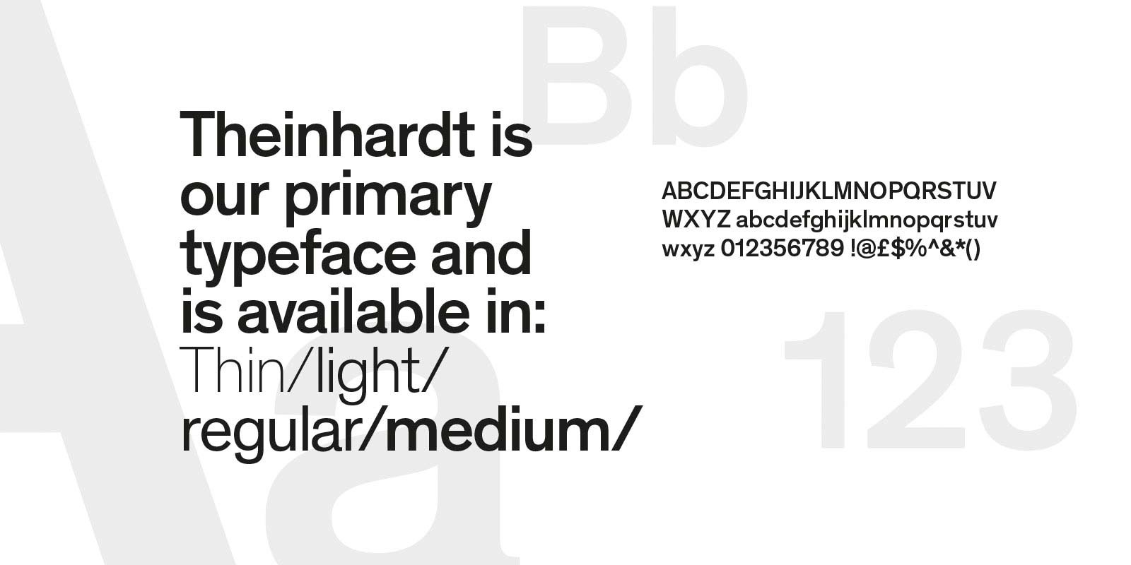
Theinhardt is our primary typeface. It is available in thin, light, regular and medium.
We use this typeface as part of our brand identity and as a way of expressing our bold, confident personality.
Theinhardt is a licenced font, therefore is available to selected staff.
Using our primary typeface
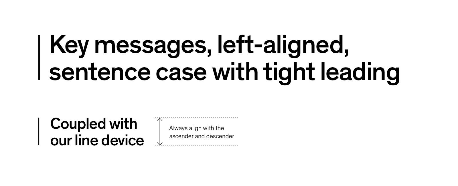
Theinhardt Medium is our headline typeface. We use this style of heading to highlight key messages. This should be the most prominent message on any form of communication. We also use the same weight of typeface in subheadings to support our main messages.
We use Theinhardt Medium to give our messaging more impact and clarity. It works well when you also give it plenty of clear space to breathe in.
When setting our headlines, we keep these left aligned and in sentence case. Theinhardt works best when the leading and line spacing is tight.
Taken from our brand logo, we also use a line device to highlight key messages. This should be a minimum of 5mm away from the headline, and the stroke weight changes based on how big the font size is.
The following example demonstrates how we lay out headings.
 There are a number of ways to use our typeface to create hierarchy within our communications. This is a guide to different typography styles we use:
- Secondary headlines: Theinhardt Medium, all capitals
- Subheadings: Theinhardt Medium
- Body copy: Theinhardt Light
- Highlighted text: Theinhardt Medium
Secondary typeface
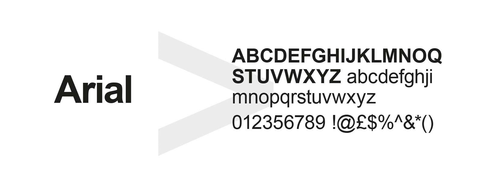
Our secondary typeface is Arial. This font should only be used when Theinhardt is not available, mostly for internal documents and emails.
It comes in 2 weights, bold and regular. For headlines use bold and for body copy, regular.
Formatting
When using our brand fonts, avoid all unnecessary capitalisation.
Write titles, headings and subheadings in sentence case (this means capitalise as though you were writing a sentence, usually just the first word).
Avoid typing in full block capitals, as this can be interpreted as aggressive, and is also less easy to read.
Avoiding unnecessary capitalisation makes reading easier for people with visual impairments. The shapes of individual letters are harder to read when capitalised. Screen readers may read capitalised text letter by letter.
If you are unsure if a word should be capitalised or not, it probably means it does not need capitalising.
For more formatting guidance, visit our dedicated page.